Github
Dribbble
Linkedin
Codepen
Volver
Design a floral arrangement preview
app for a florist
Project overview
The product:
This is an app for a florist who want to reach costumers in their city area, and improve their sales easily.
Project duration:
Start May 2022 – Ended Jun 2022
The problem:
The Green Spring flower shop, due to the pandemic, is lacking of new costumers, they want to expand the way they reach costumers by adding the opportunity to costumers to buy flower arrangements online and send them without leaving their homes.
The goal:
To reach more costumers in bigger areas, and improve the sales and delivery of flowers and flower decorations
My role:
Identify your role in the project – e.g., lead UX/UI designer, UX researcher, etc.
Responsibilities:
user research, wireframing, prototyping
Project overview
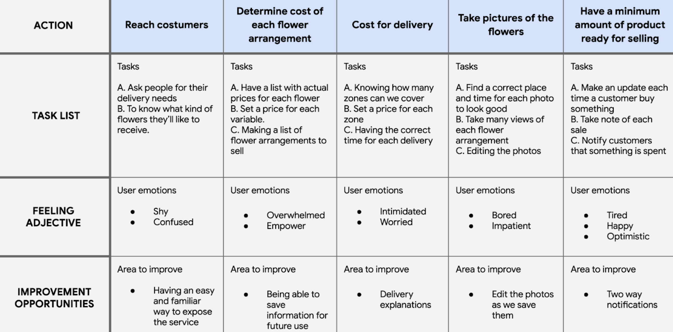
Interviews and surveys, let us know that users feel apart in many ways from their families and friends, as a way to show love and presence to their relatives, the idea of sending presents seems like an excellent idea.
As a florist app, the idea to send flowers arrangements seems an ideal option for those costumers.
- The lack of option for sending present to their relatives.
- We cannot find a delivery services for flowers, that secures a safe delivery in long distant areas.
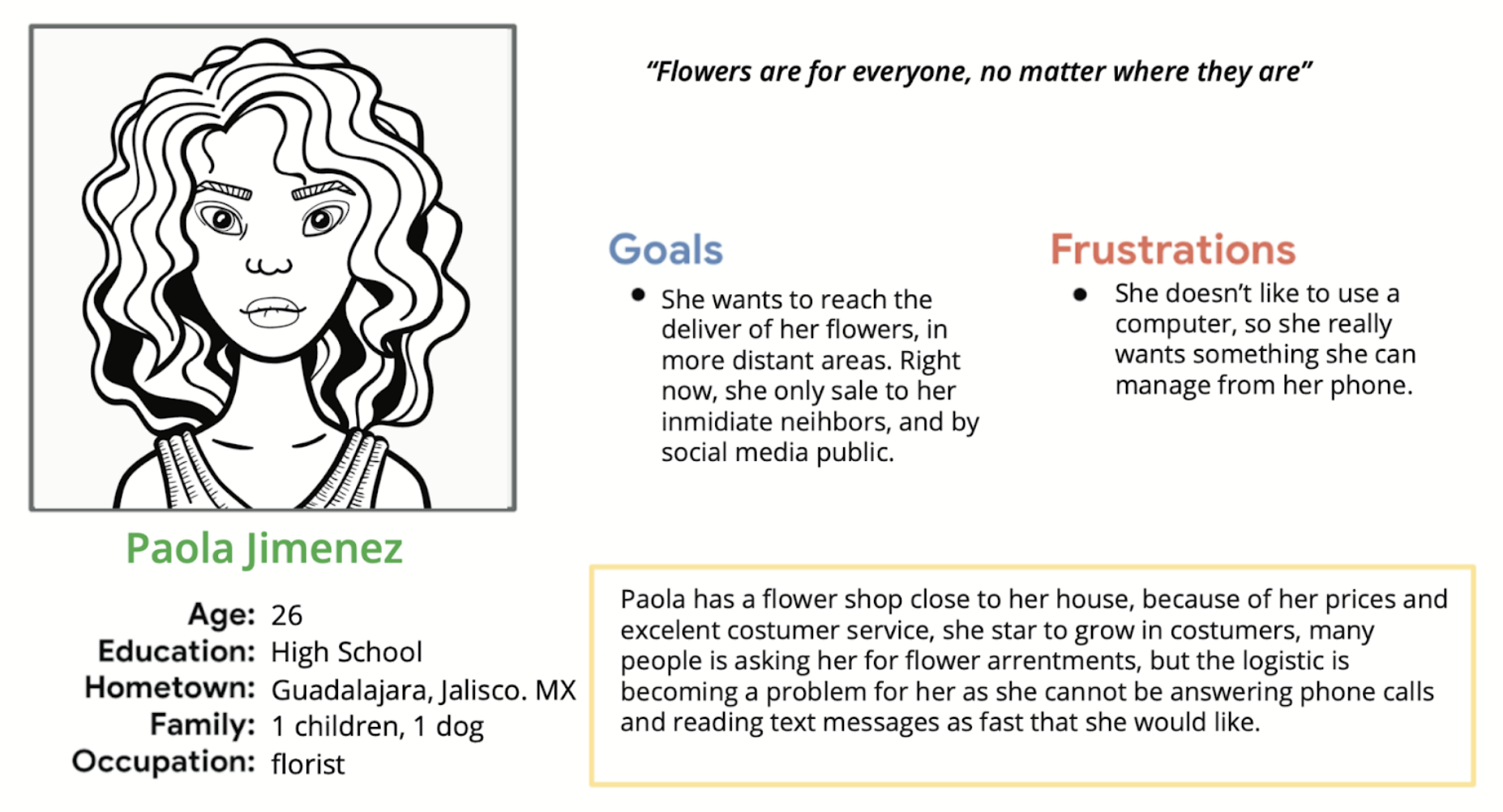
Problem statement: Paola Jimenez is a florist who needs a delivery service for her flowers, because she wants to reach more costumers in larger areas.
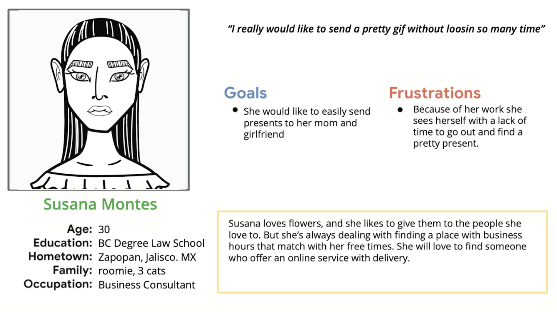
Problem statement: Susana Montes is a lawyer too busy for going to buy presents and flowers by her own. She wants an easy way to buy and send flowers from everywhere.
Starting the design
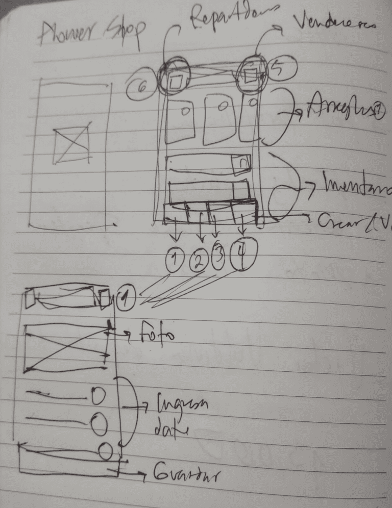
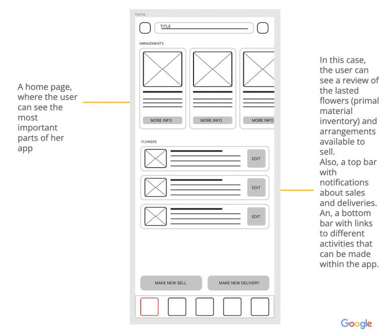
Paper wireframes
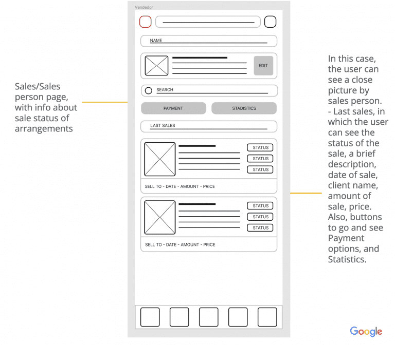
I create 2 main screens, one for showing a big picture of the data and to upload information, like, inventory, flowers, arrangements, etc.
From these two screen I design the rest of the screen needed.
Digital wireframes
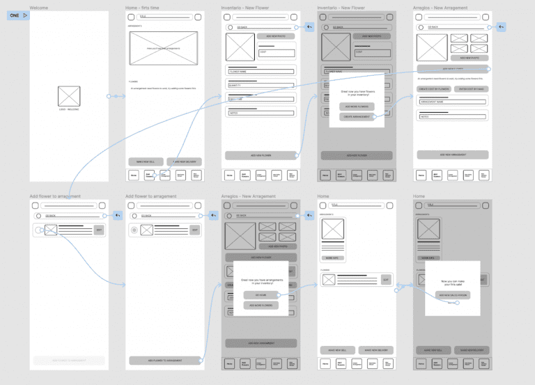
Low-fidelity prototype
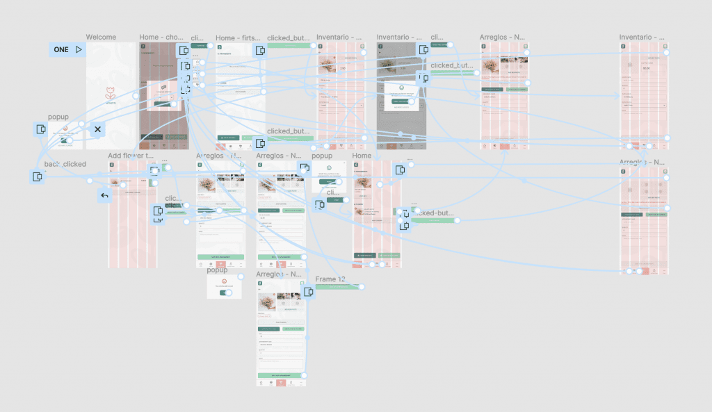
User flow of the creation of an arragement, and update inventory.
Usability study: findings
Write a short introduction to the usability studies you conducted and your findings
Round 1 findings
- User needs more clues about how to finish
- User needs to change to switch between languages
- User wants a more clear instruction of success finish.
Round 2 findings
- User needs more responsive design
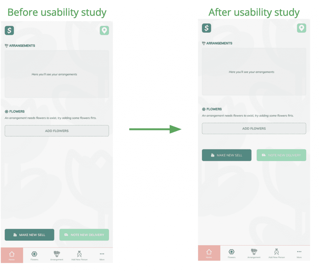
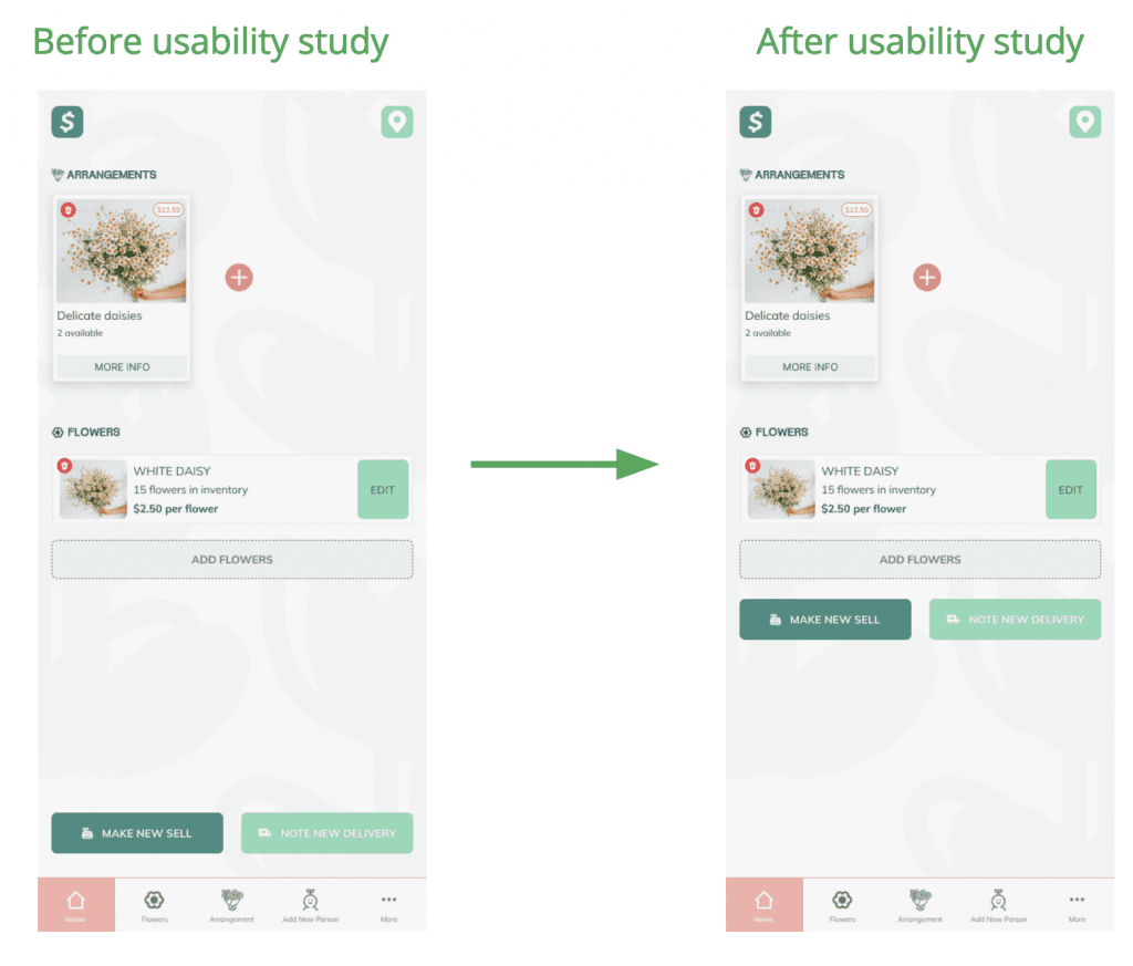
- User wants less white space between components
Refining the design
Mockups
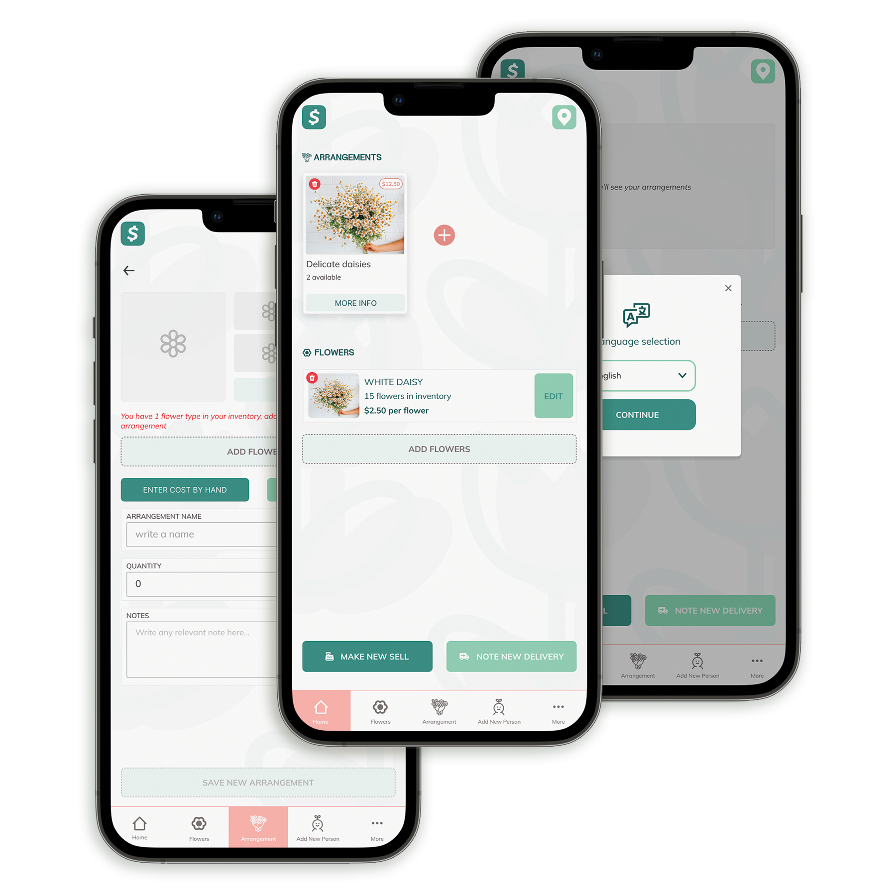
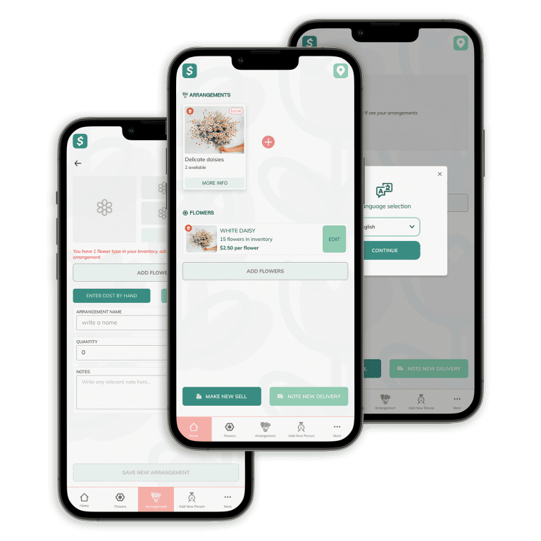
White space was a problem for the user, so we keep it at minimum.
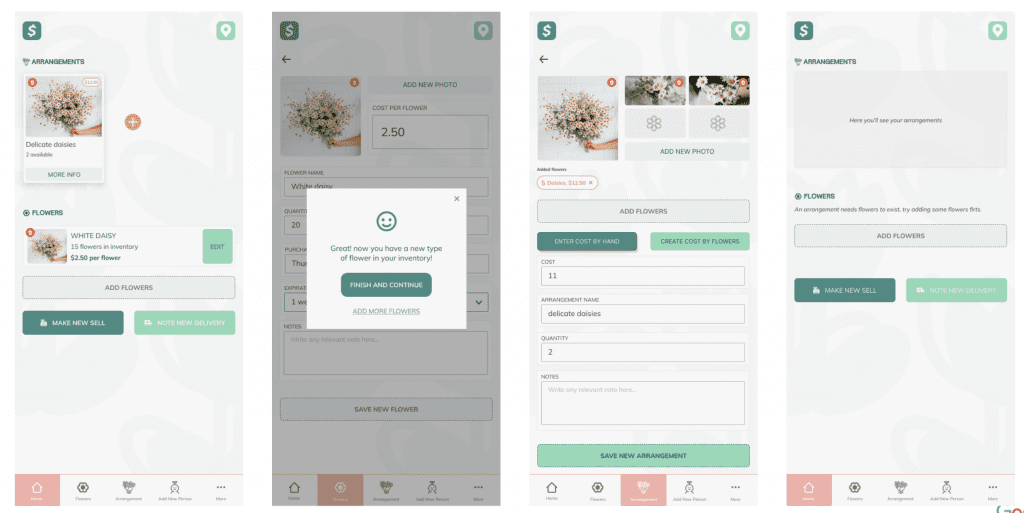
High-fidelity prototype
Accessibility considerations
Multilanguage
Multilanguage options, not everyone speaks or read English, so base on the usability studies, we considered for now, adding the second most used language option: Spanish.
Space
Less white space for smaller devices.
In the case of short and low resolution devices, most people could feel lost if the elements aren’t visible at first, sigh.
Color
Soft color palette, so it doesn’t feel too bright or to contrast, easy to read and follow.
Considerations for the future included a Dark Mode version.
Going forward
Takeaways
Impact
5 of 5 user feel comfortable using the app after the usability studies changes.
They feel like the app is easy and fast to use, and keep the upload of products simple.
What I learned
While designing the Boho’s app, I learned that the first ideas for the app are only the beginning of the process. Usability studies and peer feedback influenced each iteration of the app’s designs.
Next steps
ONE
Design a Dark Mode for the app, so the users feel more comfortable using the app for long periods of time.
TWO
Introduce new languages, so we don’t limit the usability only for English/Spanish readers.
THREE
Conduct more user research to determine any new areas of need.
